Heartland Community College is located in central Illinois and serves more than 5,000 students every year with more than 700 faculty and staff. To better serve and support it’s employees, Heartland’s communications leadership team worked with PixelMill, a Sharepoint design studio in Davis, Ca., to design and develop a brand new employee intranet built on Sharepoint.
Goals
By having an employee intranet for the first time, the Heartland communications leadership team wanted to address several issues they had been experiencing throughout the years. In our initial set of meetings, we were able to assess their needs and defined the following goals that the intranet was to address:
- Improve the reach and effectiveness of the colleges’ communications to all employees
- Increase employee engagement, both with the college and with their fellow colleagues
- Make it simpler for all employees to find important documents and employment related information
Role
I joined the PixelMill team as a contract UI/UX designer. As such, I collaborated with two other UI/UX designers, a business analyst, and a project manager to conduct user and business research in order to assess all the needs and wants of our stakeholders. Then, I worked closely with the design team to utilize this research to design a user experience that would solve for all of our goals and then design a visual interface that would reinforce the Heartland Community College brand while further enhancing our newly crafted user experience.
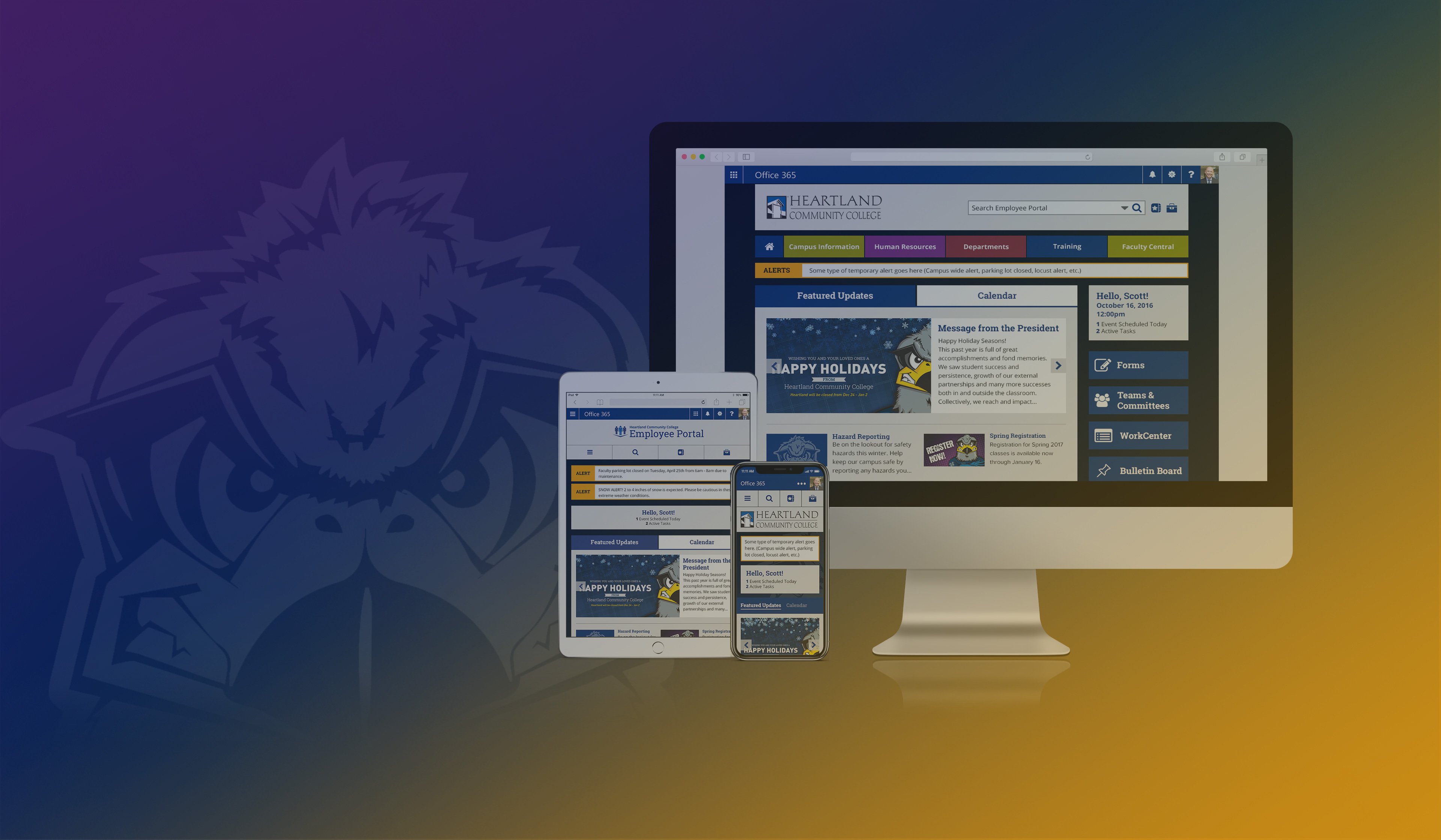
Before
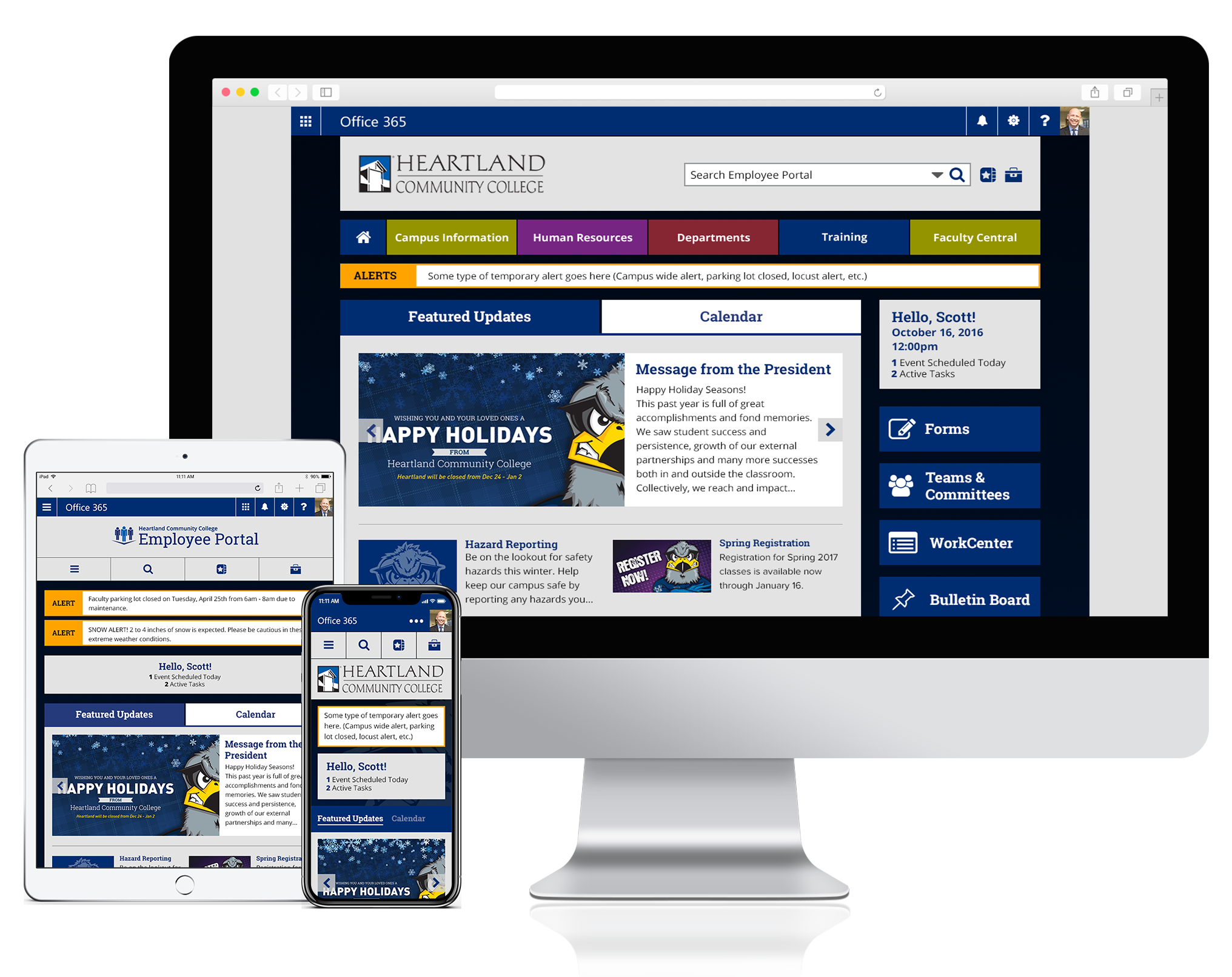
After
Research and Strategy
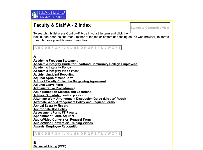
With a set of high-level goals defined, we set out to discover what some of the more specific needs and wants of our users were. We conducted user interviews with staff and faculty of various departments and seniority levels and through this, we learned that the hierarchy of the needs of our users did not exactly match the goals outlined by the communications leadership team. In fact, we learned that while the defined business goals prioritized better ways of communication between the college and it’s employees, these employees cared more about accessing important files and information relevant to their job—such as pay stubs, benefits information, and HR resources.
With the Heartland communications leadership team and employees deeming most important two different sets of information, we made sure that our defined personas, user stories, and use cases incorporated both of these priorities in order to make appropriate user-centered UX decisions while still meeting the business goals. This meant creating a UX strategy in which both the presentation of news and announcements was just as important as easy access to a wide variety of employee resources.
Examples of use cases defined through our research
Use Case #1: Centralized Information Hub
I am unable to reach important organizational news and events. I find it vital to stay up-to-date on current events at Heartland. I also would like to see time sensitive alerts on my home page. The lack of accessibility makes me feel disconnected from my organization and our goals.
Use Case #4: Responsive Design
As a user, I would like to be able to access the Heartland Employee central site, from different off-site and on-site locations and on various devices.
Use Case #5: Navigating Content
As a user, it’s confusing trying to navigate around the current sites, drives, and departmental information. I’m not always sure where to go, the navigation structure is not laid in a consistent manner and the path to relevant content is not always intuitive.
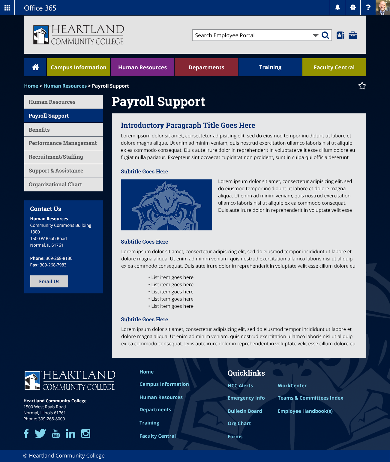
User Experience
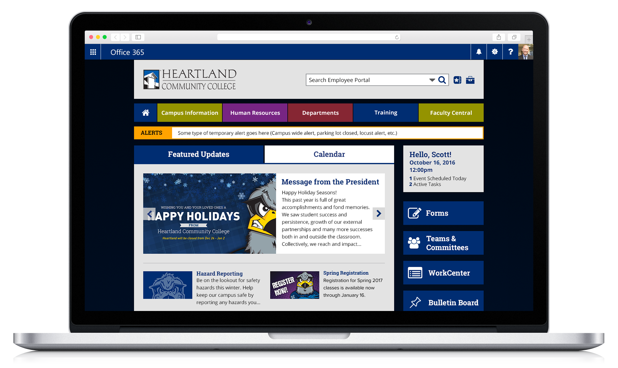
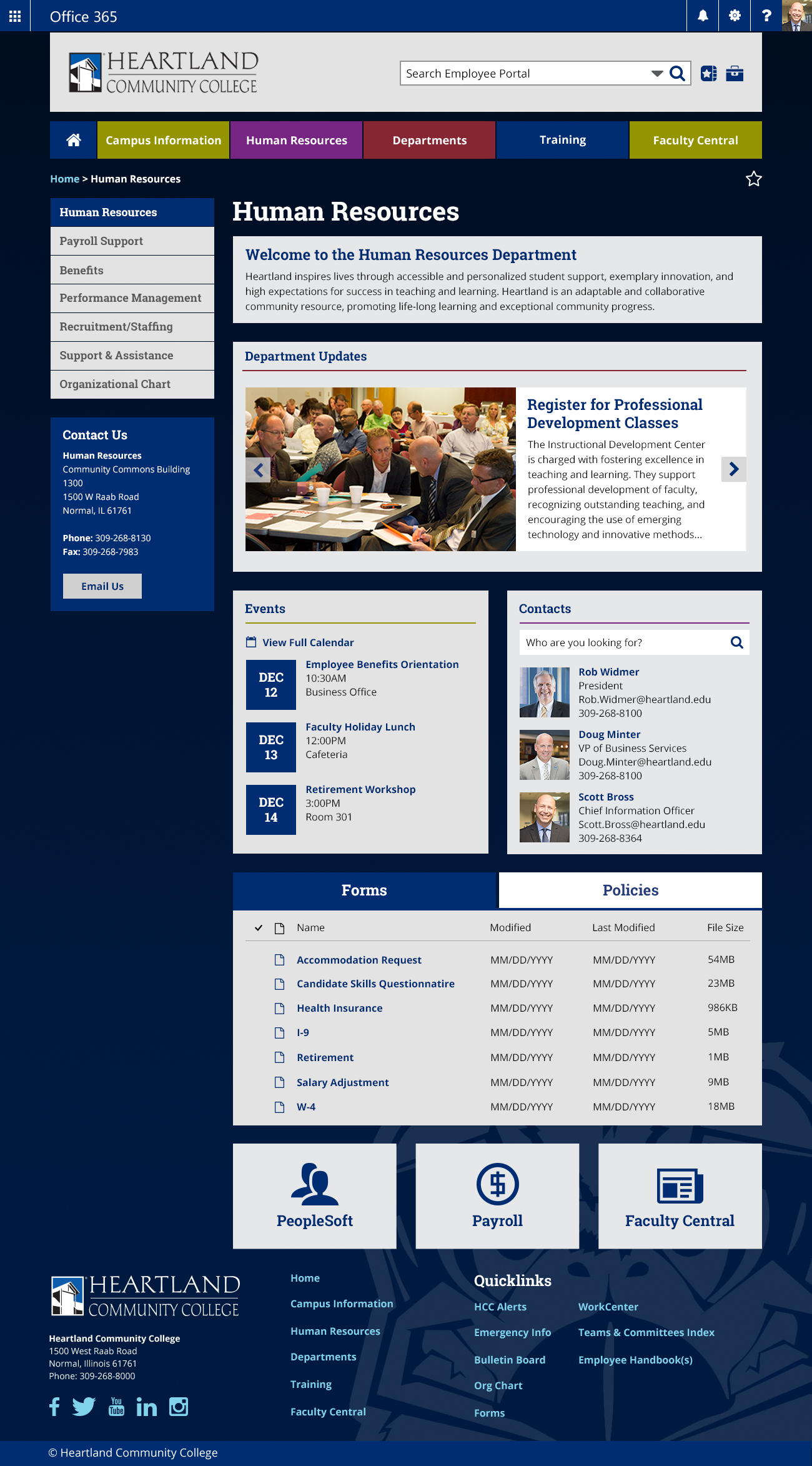
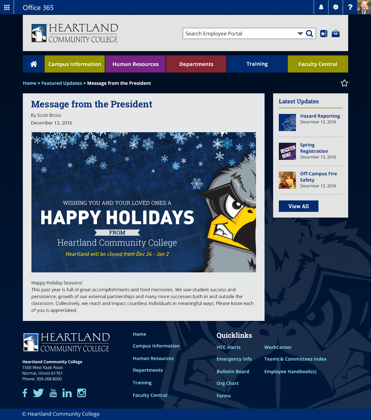
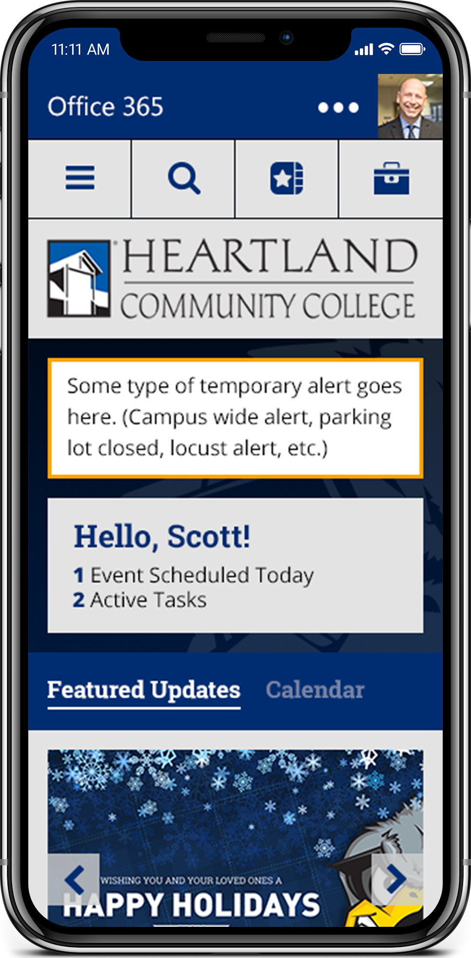
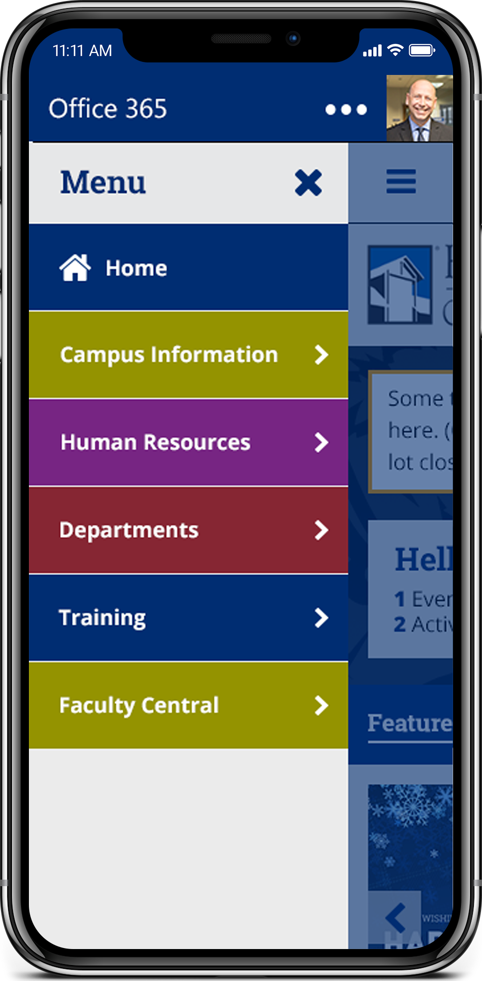
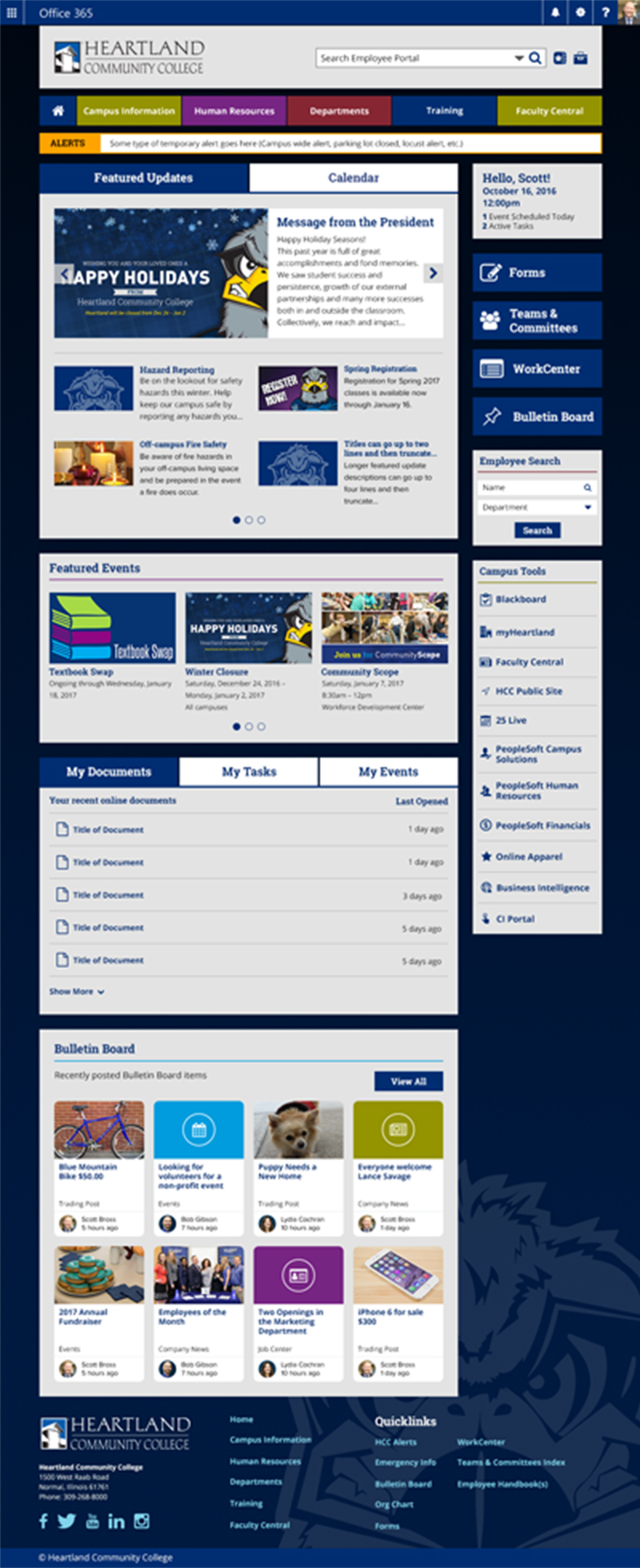
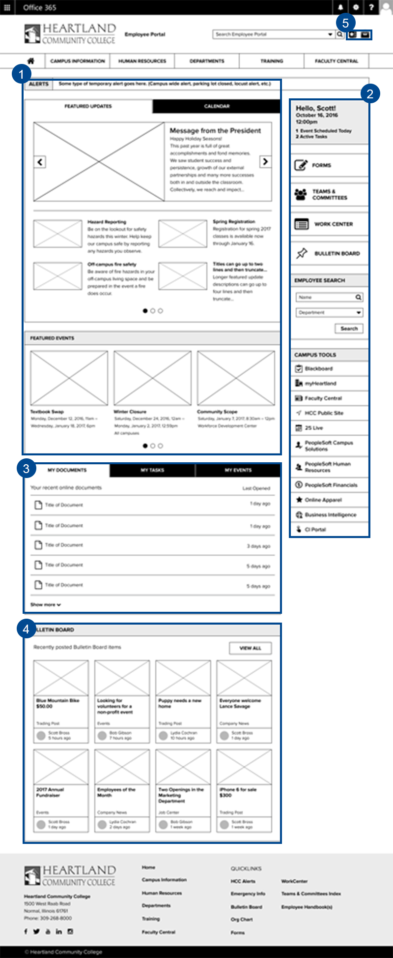
To implement our complex strategy, we set out to craft a user experience that was heavily inspired by the concepts and UX patterns of a dashboard, where the homepage displayed a lot of information in a concise and intuitive manner. Through the wireframe iteration process, we a crafted layout in which the content would be organized into modules that were categorized based on our redefined information architecture.
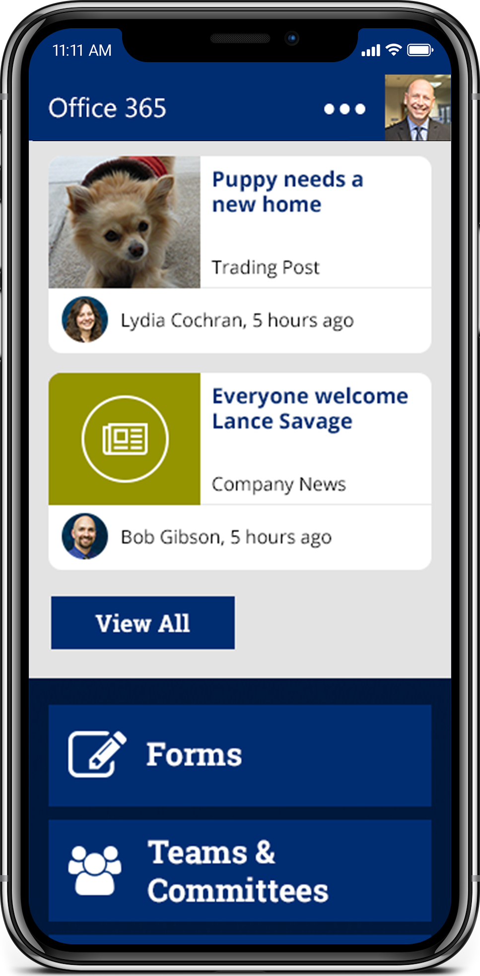
By doing this and implementing effective use of local navigation patterns—such carousels and tabs—we were able to arrange the many layers of content into a homepage dashboard-style experience. With the primary focus on the news and announcements section on the page (1), Heartland could communicate more effectively with all staff and faculty members, while the addition of local sidebar navigation provided staff and faculty members with the easy access to documents and campus resources they needed (2). To build a better sense of community among staff and faculty members, we also designed a “Bulletin Board” module (4), through which all users of the intranet could post their own news snippets, whether they were trying to find a new home for a puppy or welcoming a new staff or faculty member.
As we further refined the user experience and worked through iterations with the Heartland communications leadership, we discovered that it would be helpful to our users to expand the functionality of this intranet and incorporate some of the additional tools they used everyday. Thus, we decided to include a module where they could see their personal documents, tasks, and events from Work Center, an internal project management system for faculty and staff that the PixelMill team and I also worked on (3). Finally, to take this a step further and make it even easier for employees to access content that was important to them, we added the ability to add custom links to a ‘Shortcuts’ menu (5). With all these elements coming together, we accomplished in creating a centralized experience for our users, one that served as a one-stop hub for all their needs and communications with the college.
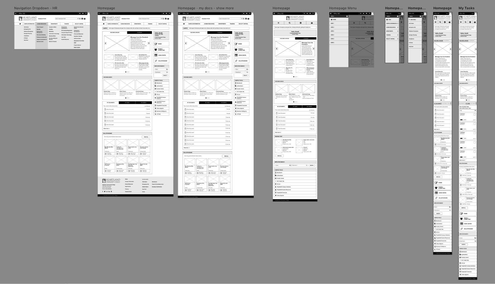
By designing the UX of desktop, tablet, and mobile screens all at once, we were able to create a cohesive and responsive process flow strategy.
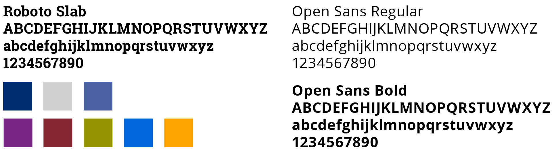
Visual Design
Once we had designed the user experience, we went on to enhance and refine it by designing a user interface that followed Heartland’s brand and style guidelines. Having designed a very light and minimal interface in the Heartland Work Center, the communications leadership team wanted the employee intranet to look as a “cousin” of it—related, but different. Thus, we we went with a darker-themed interface that still expressed the college’s brand, while following the same principles of openness and simplicity through application of white space and setting of typography.