As one of the largest and fastest-growing home vendors in the greater Sacramento area, JMC Homes prides itself on offering high-end homes that it develops, designs and builds. To match the high quality of their products, JMC Homes felt that their website was in need of an upgrade and partnered with Cake Farm, a web design studio in Fair Oaks, to modernize the look and feel it and improve the user experience (particularly on mobile), which in turn would help them generate more leads and conversions.
Goals
Through a series of initial meetings, JMC Homes and Cake Farm were able to come up with a set of goals that the redesigned website was to accomplish:
- Modernize the visual interface of the website and improve the presentation of content
- Find a way to better showcase their products—beautiful homes designed and built with strong attention to detail
- Improve the user experience, particularly on mobile, so people spent more time looking at the details of their potential home instead of figuring out how to navigate the website
- Generate more leads and convert more visitors into home owners
Role
Working as a UI/UX designer for Cake Farm and under the direction of the creative director, I was responsible for designing the user experience and interface of the new JMC Homes website. Once approved, I was then responsible for working with the development team to ensure the approved designs were built with the highest accuracy possible.
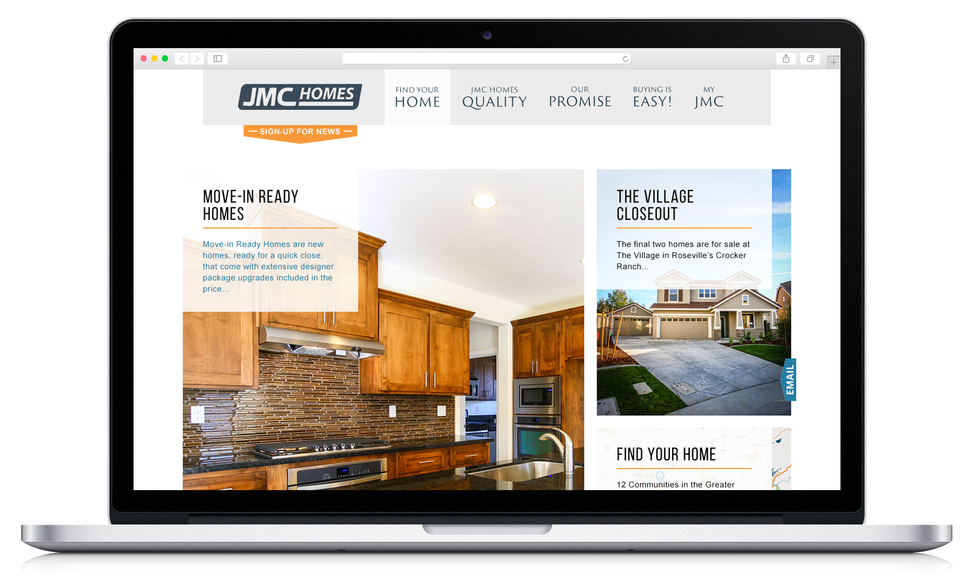
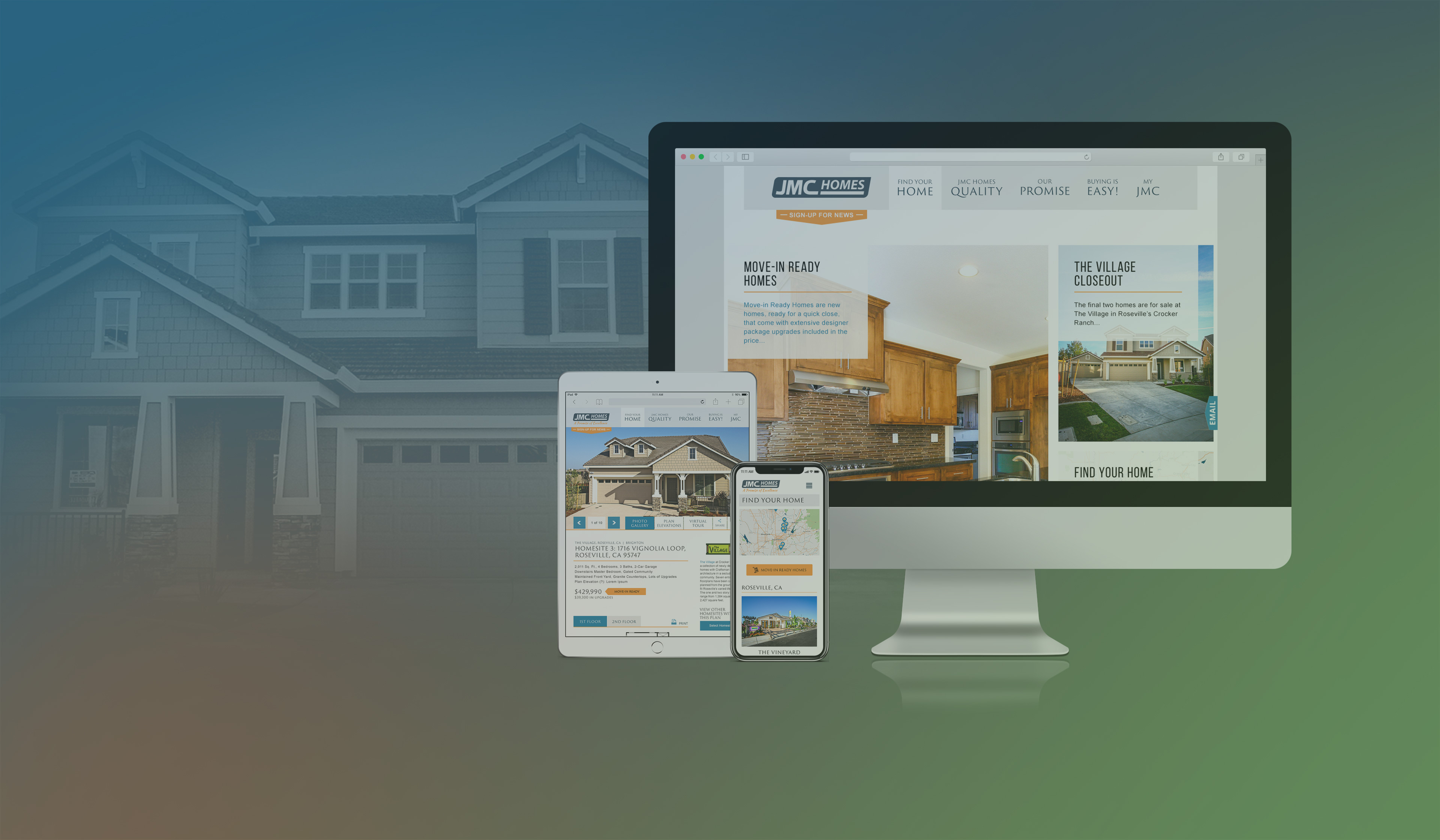
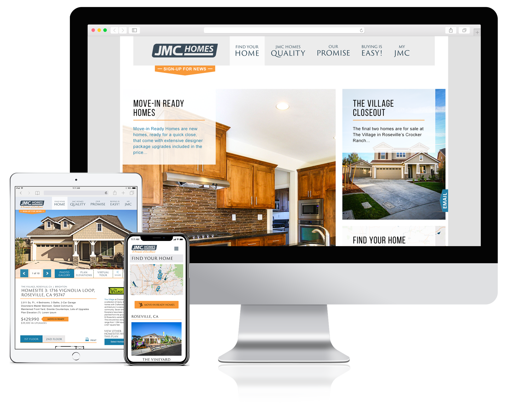
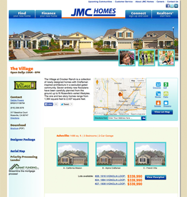
Before
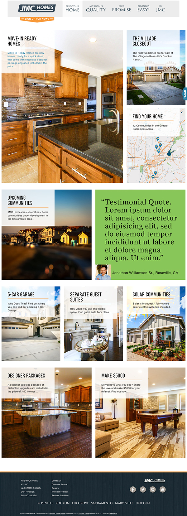
After
Research and Strategy
With defined business goals in place, we wanted to get to know and understand our users’ needs. To do this, we conducted user and stakeholder research via a series of questionnaires and in-person interviews through which we discovered that our target audience—defined as educated professionals in their 30s–50s—wanted a much more visual and modern online experience through which they could see, not just read, the details of their potential home before they considered contacting a sale representative. We also found that many of our users had families, which, in addition to their jobs, really limited the amount of time they had to sit down and shop for homes. Thus, we brainstormed how to create an easier way to compare and refer back homes they were interested in, which led to the creation of myJMC—a new way for users to create an account and save any homes they were interested in for future reference or comparison.
Examples of use cases defined through our research
Use Case #1: Responsive Design
As a user, I am short on time and always on the go. I would like the mobile experience to be simple and intuitive.
Use Case #2: A More Visual Experience
As a user, I would prefer to see more photos of homes in order to see the details of each home and decide which ones fit my personal tastes the best.
Use Case #3: Saving and Comparison Features
As a user, I would like a way to save the homes that I like in order to reference them later.
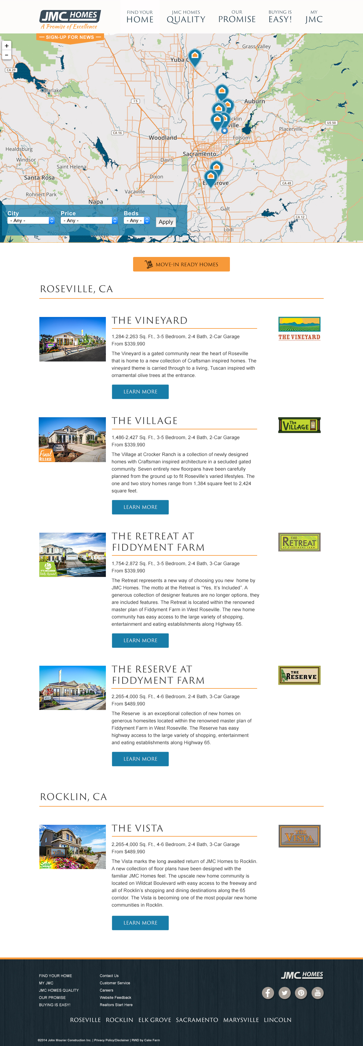
Use Case #4: Upgraded Map Search and Sale Status Functionality
As a user, I would like the search functionality to be easier and I would like to know the sale status of a home without having to call.
User Experience
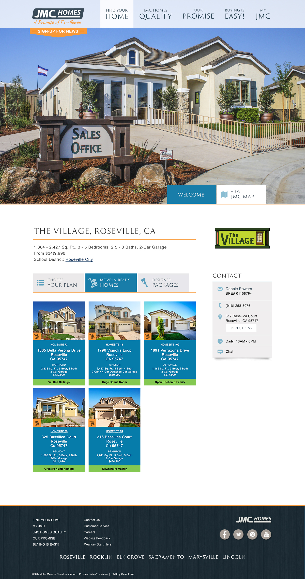
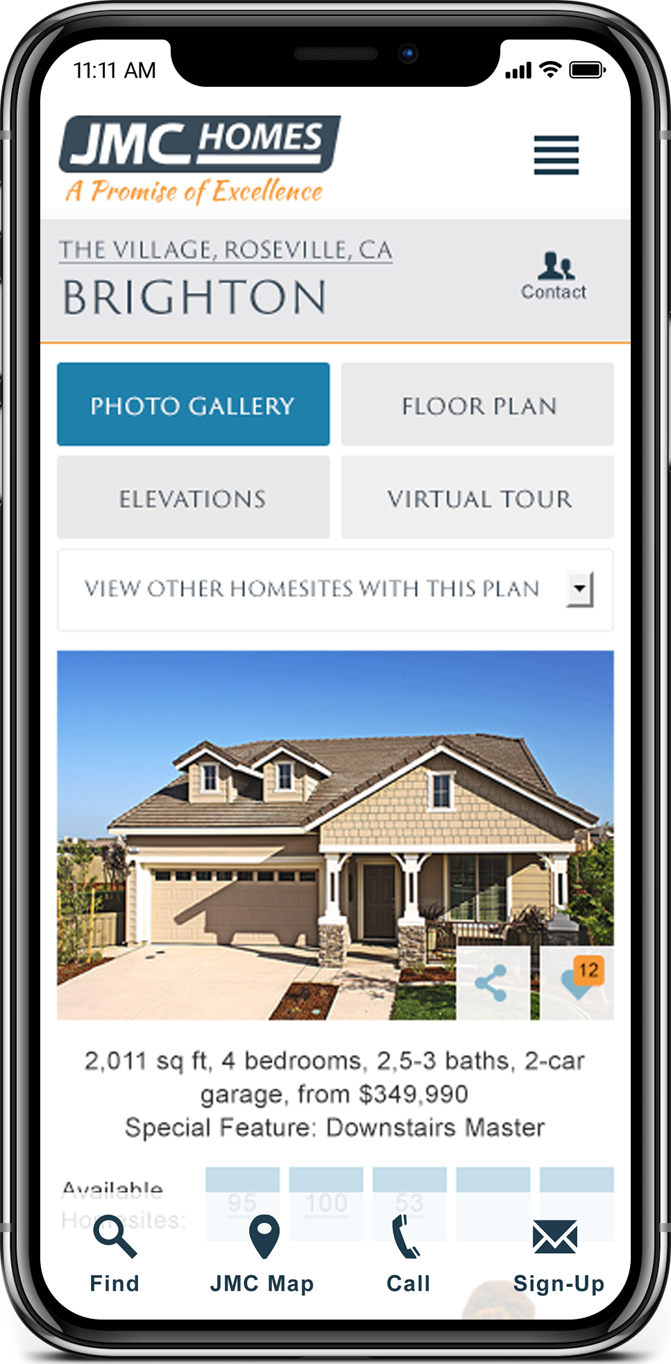
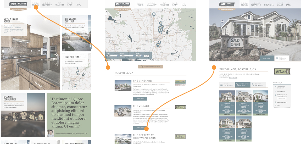
Once we had a better understanding of our users and crafted a user-centered strategy, our next step was to simplify the information architecture in order to build an easier way of navigating the site. Together with JMC Homes, we refined the information architecture to have only six main navigation links, and in doing so, we re-wrote the navigation language and general content to better reflect JMC’s mission and values. Furthermore, with a simpler information architecture structure, we were able to reduce the amount of steps it took to get to a specific community or house page which meant that our users could spend more time looking over the details of their future community and home rather than searching for it on the site.
Process flow of getting to a community page, simplified to two steps.
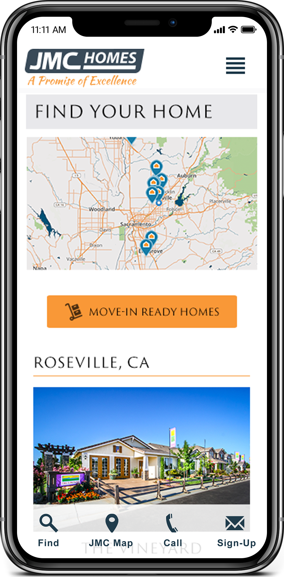
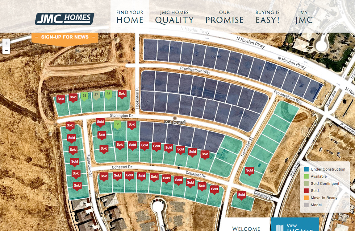
To enhance the home searching experience even further, we also integrated a new satellite map feature, through which users were able to look at a satellite map of any community and quickly be able to see the market status of every home in that community—from “under construction” to “move-in ready” to “sold”.
Interactive satellite Map with Sale Status of homes in a community
To conclude the process of searching for a home through the website, we worked through the process flow of myJMC, a new tool that allowed users to create an account and save any home they were interested for future reference and comparison (1).
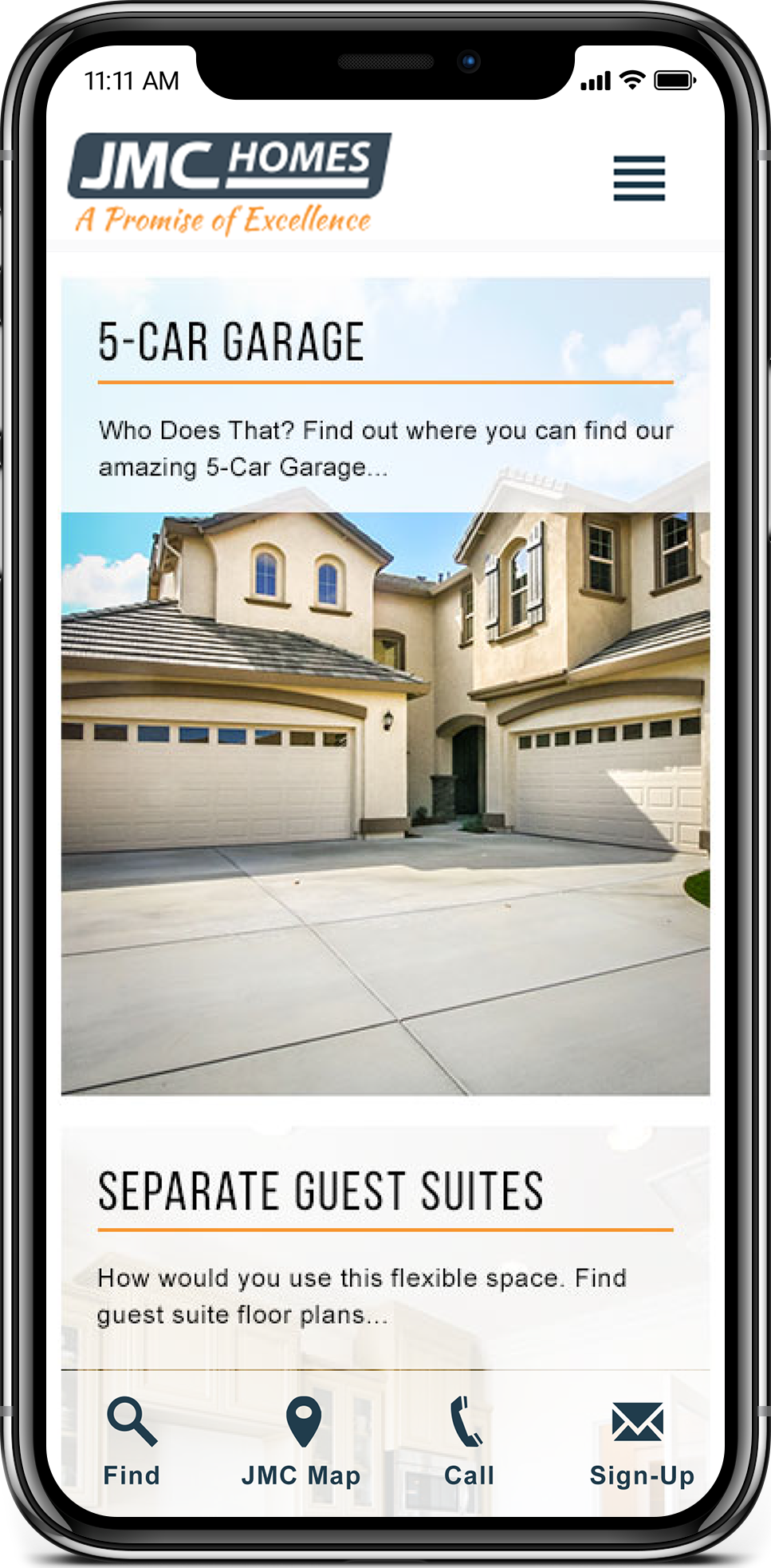
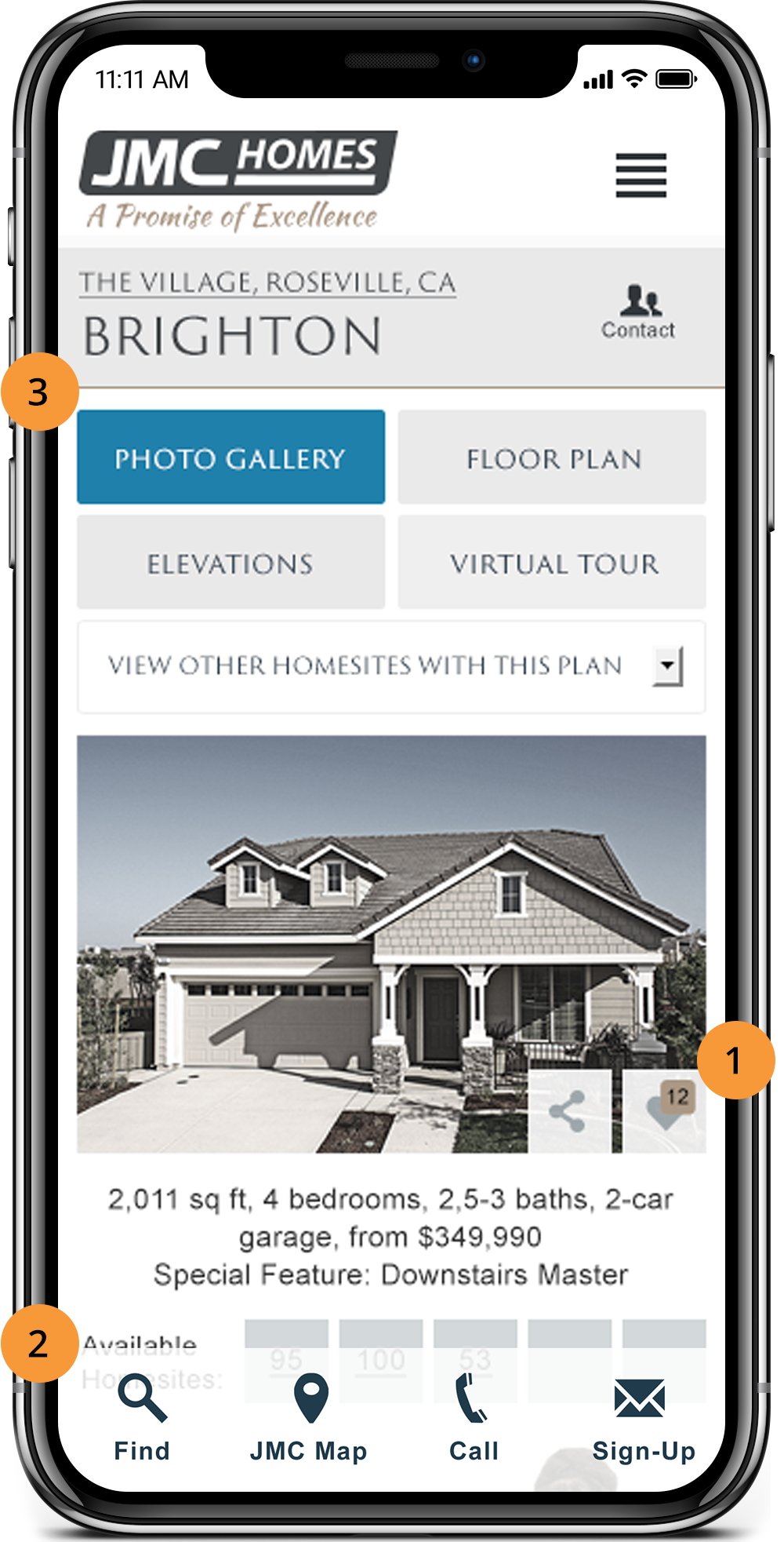
Finally, we took additional steps to ensure that these principles translated well when viewing on mobile. Instead of simply making the information responsive, we looked at established design patterns to find ways to optimize the mobile experience, such as including a sticky footer (2), adding local navigation button (3), and taking advantage of accordion and other content-organizing ux patterns.
Visual Design
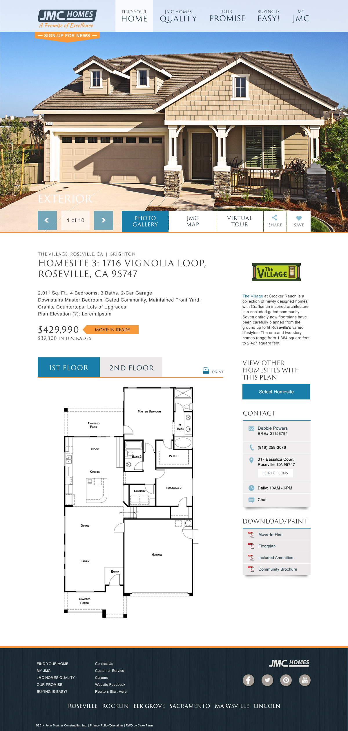
Once we had built a solid user experience, we brought in visual elements to incorporate the look and feel of the JMC Homes brand. We took the layout we had drafted when defining the experience and process flows and refined it by opening up the white space, setting the typography to be simple, calm, and subdued manner.

By having a simple and refined interface, we allowed for the photos to take center stage and become the primary focal point of almost every page, letting the user become invested in the beauty and detail of their next potential home. To support this layout, we also designed a pattern library of icons, buttons, and cards that followed the same principles of simplicity and intentional use of color. These patterns were applied throughout the site to ensure consistency every page and represent the JMC brand effectively.