With expert knowledge on a variety of topics revolving around food safety, UC Davis Western Institute for Food Safety and Security (WIFSS) conducts research, develops training materials, and provides outreach programs and workshops that increase the awareness of the health and security of people, food, animals, and the environment. Through the WIFSS website any one can access educational resources like booklets and training videos, sign up for training sessions for federal certifications, and read about the latest research the team is conducting.
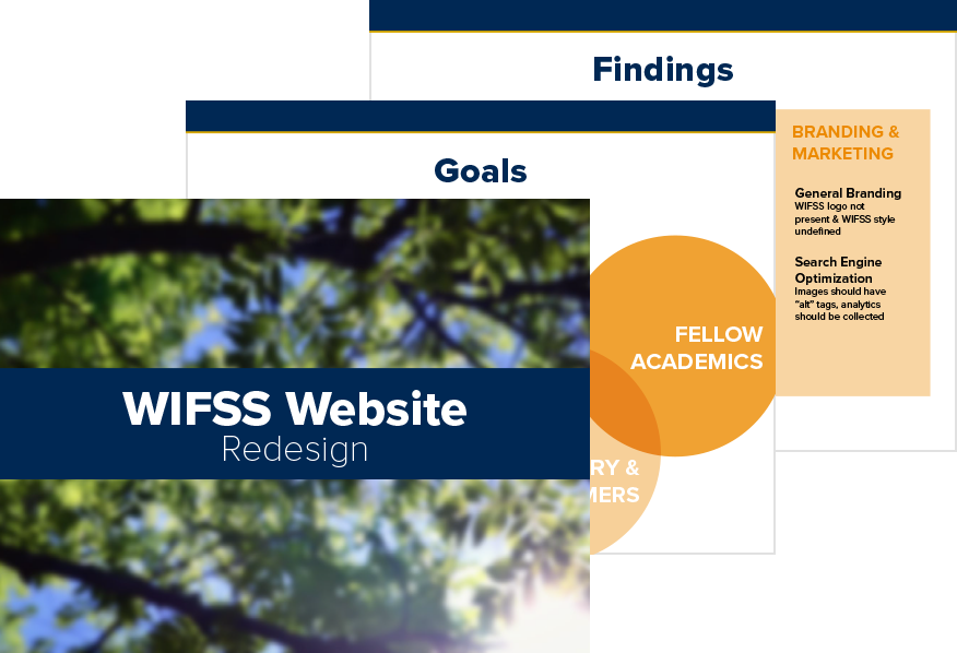
Goals
The WIFSS executive leadership wanted to redesign the department website to make it easier for the public to have quick access to all the information the department had to offer. In addition to this, they also determined that the website should serve as an online portfolio of the department’s research, publications, and outreach work for other fellow researchers, academic colleagues, potential partners, and clients to view. This in turn would help increase awareness about WIFSS, their work, and create new opportunities for the department to grow it’s research, training, and outreach capabilities.
In meeting with the leadership team, we determined that the website redesign should accomplish the following goals :
- Provide more intuitive access to training, education materials, and publications
- Present current research projects in a more relevant, modern, and professional manner
- Modernize the user experience and interface, including creating a responsive design optimized for mobile devices
Role
As a graphic designer and web developer for WIFSS, I was responsible for leading the redesign and development of this new department website. As such, I lead our team—which consisted of a senior graphic designer and web developer, a program coordinator, an IT specialist, and a public relations specialist—through all stages of the project, including the discovery, design, and development phases. Throughout the course of this project, we conducted user research, defined the department’s and users’ goals, created a new content strategy, redefined the user experience through wireframes, presented a new visual interface through mockups, and developed our new design on a heavily customized WordPress theme.
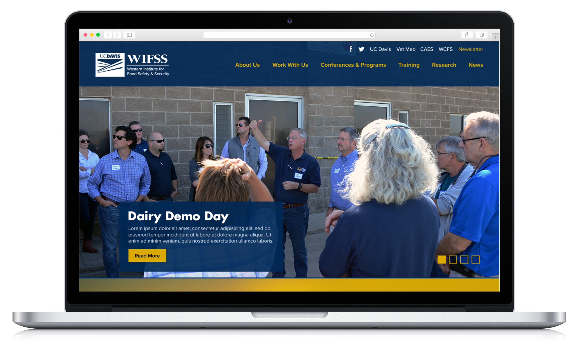
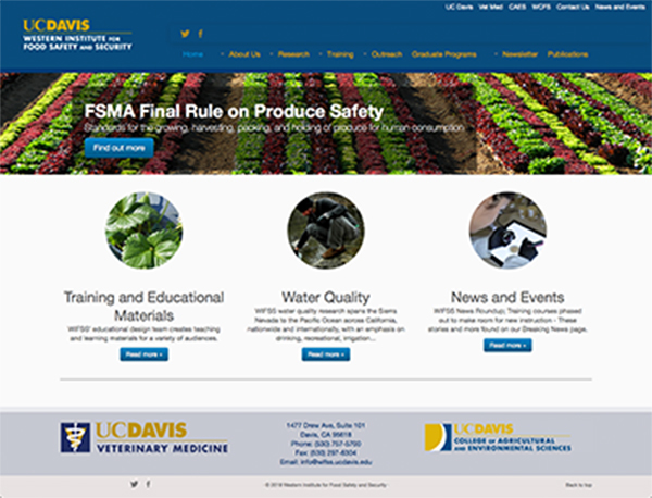
Before
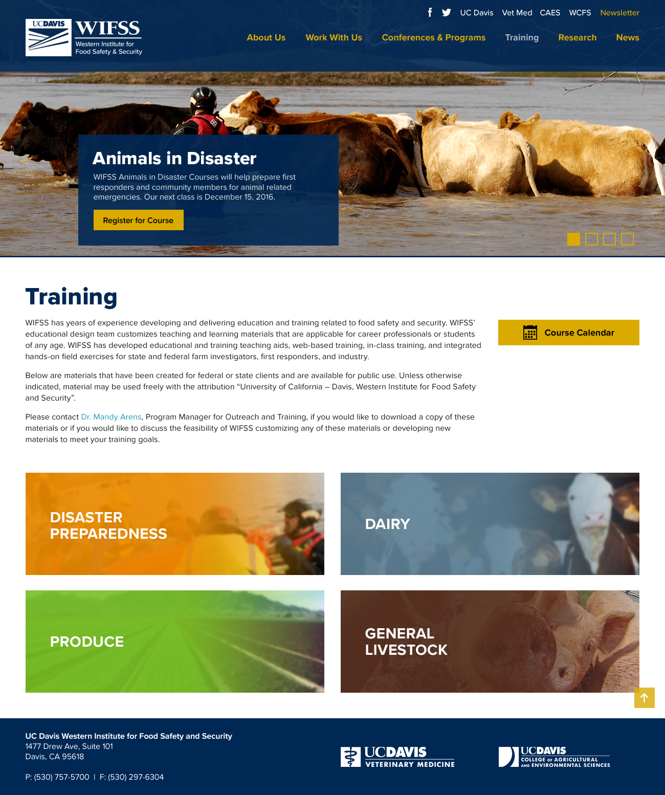
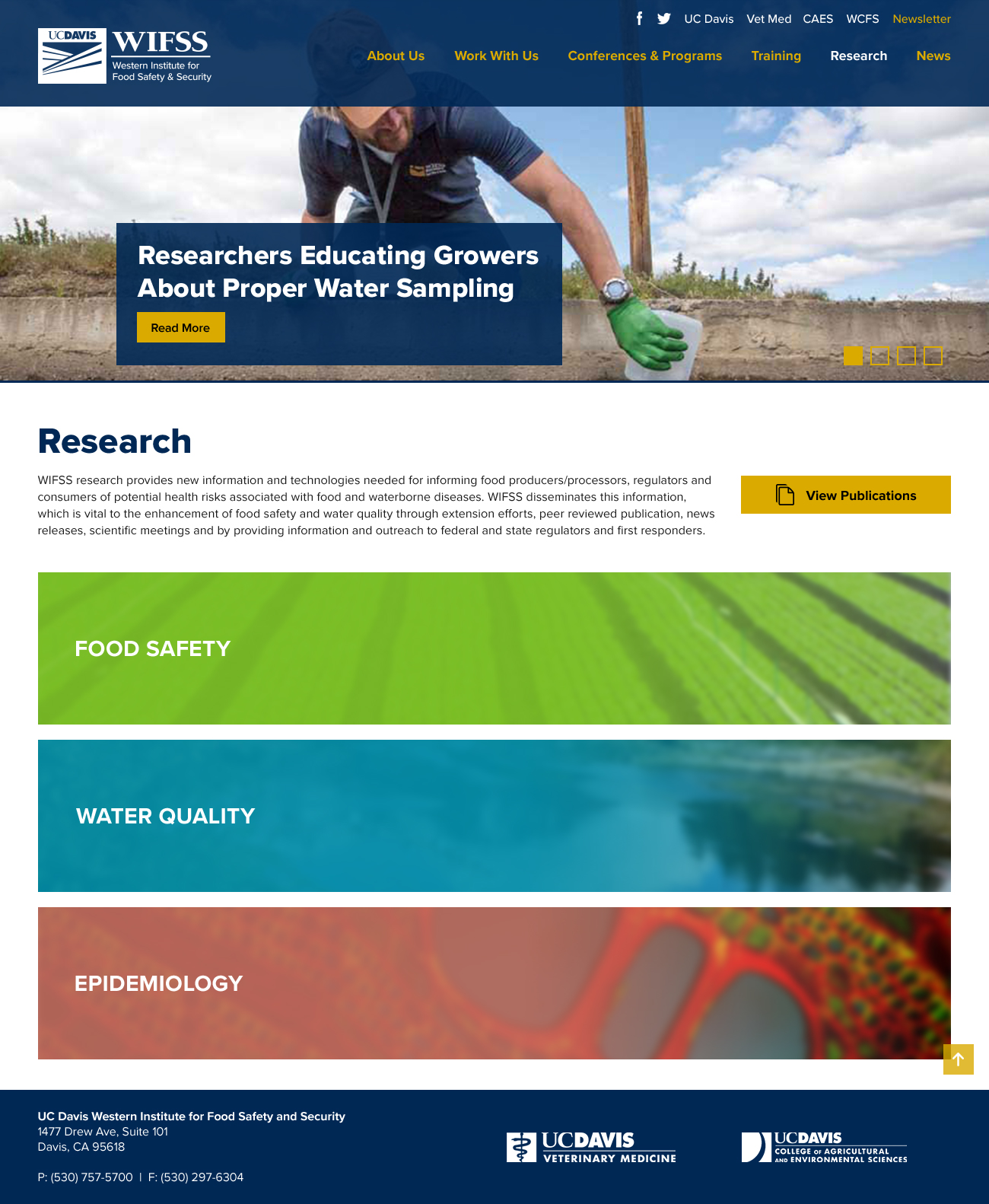
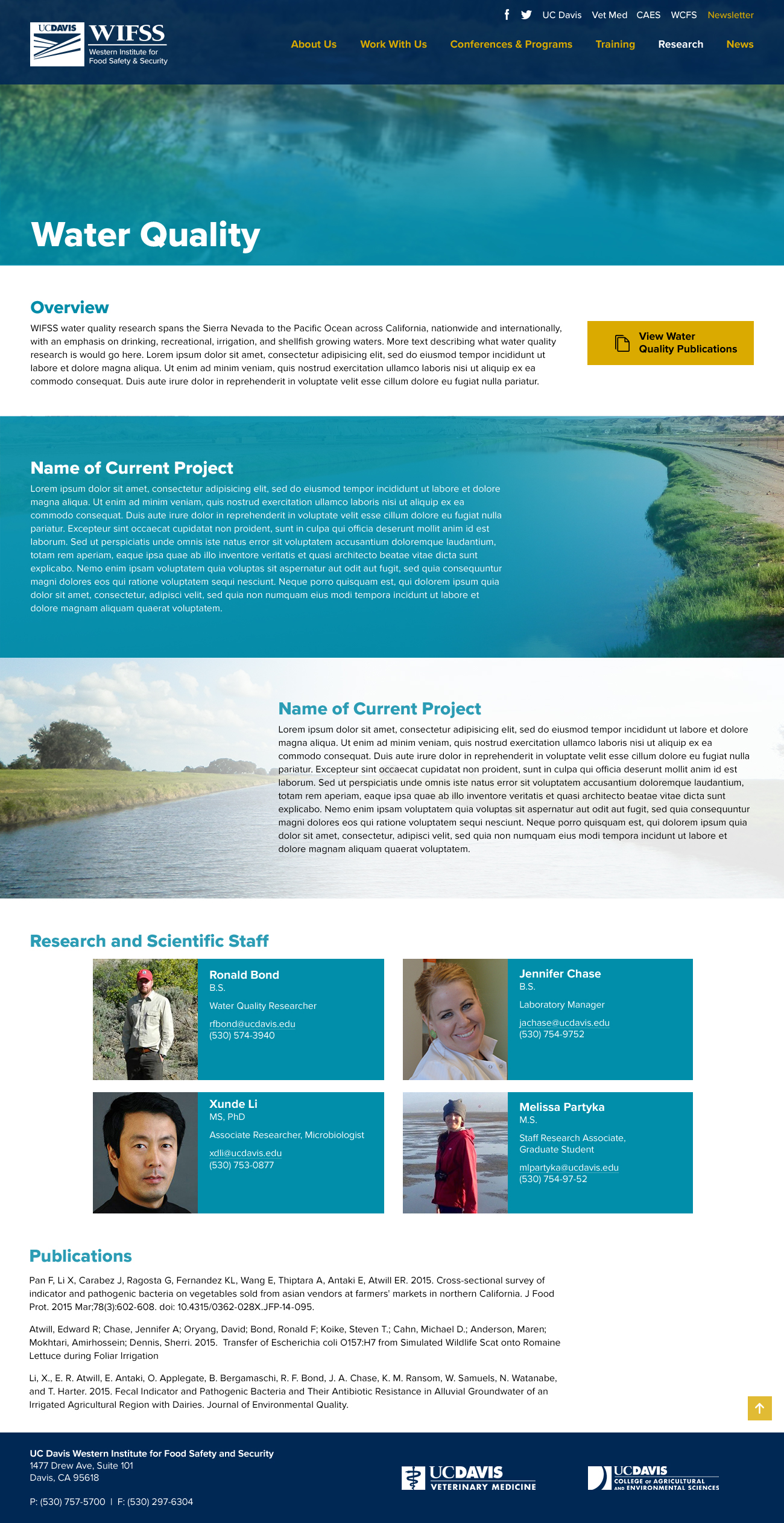
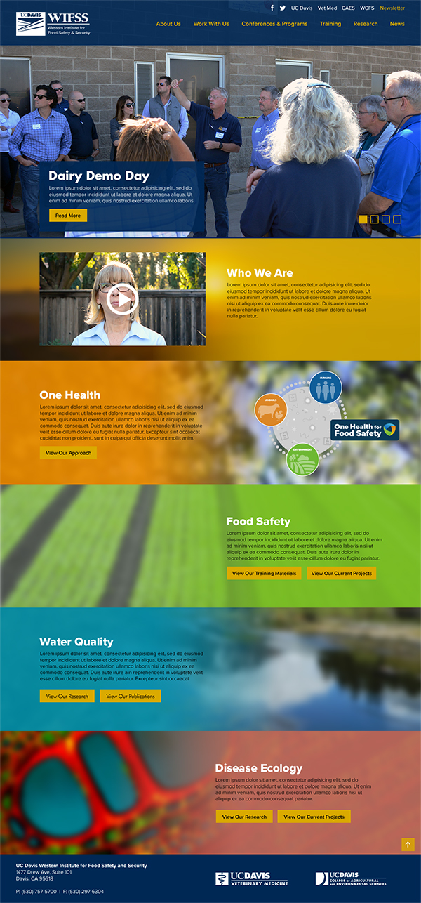
After
Research and Strategy
In addition to meeting with the leadership team to asses their goals and needs of this website redesign, we also conducted a series of user research tasks to attain more information that could better guide our decisions. Our research included questionnaires, card sorts, and in-person interviews with users within our targeted audience—the general public, people involved in the agriculture and livestock industries, and academic colleagues.
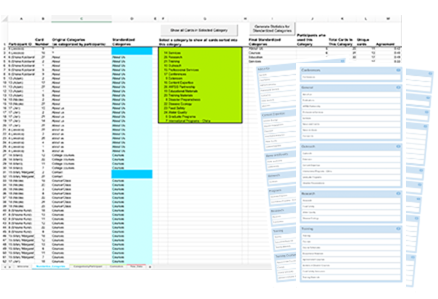
Card sort results and analytics spreadsheet
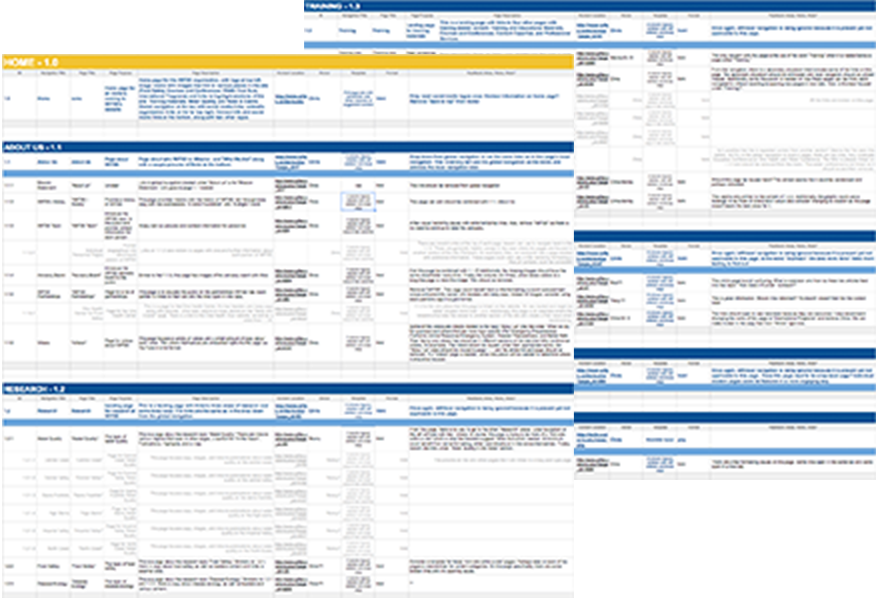
Content inventory spreadsheet
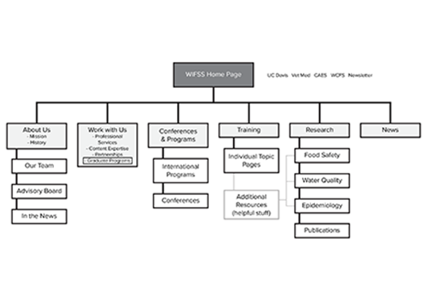
Redefined, simpler Information Architecture
Through this research, we found that our selected group of users had similar goals to those set by the leadership team: to be able to access training and research materials quickly and have a much more modern and refined interface. One important discrepancy we did find, however, was that the labeling of the information architecture proposed by the leadership team did not exactly make sense to those outside of WIFSS.
In our card sorting activity, for example, our users were consistently unsure of what terms like “Outreach” really meant. To clarify instances like these, we worked with the leadership team to reorganize and condense content, which then allowed us to rework the labels of our information architecture to be more straight forward, such as changing “Outreach” to “Events & Programs”. Furthermore, restructuring the content and making it more concise allowed us to reduce the number of navigation items from nine (with additional second and third level sub links) to only six (with no sub-level links).
Examples of use cases defined through our research
Use Case #1: Making Primary Content More Accessible
As a user, I feel that the current site makes it a little cumbersome to access training materials. I would like for this to be much simpler and easier to view on the site.
Use Case #2: Specific Research Area Pages & Permalinks
As a content owner and WIFSS researcher, I want to be able to share my work with my colleagues by giving them an easy URL, one that anyone can remember, as well as making it easy for them to access the work being done in a specific research area of WIFSS.
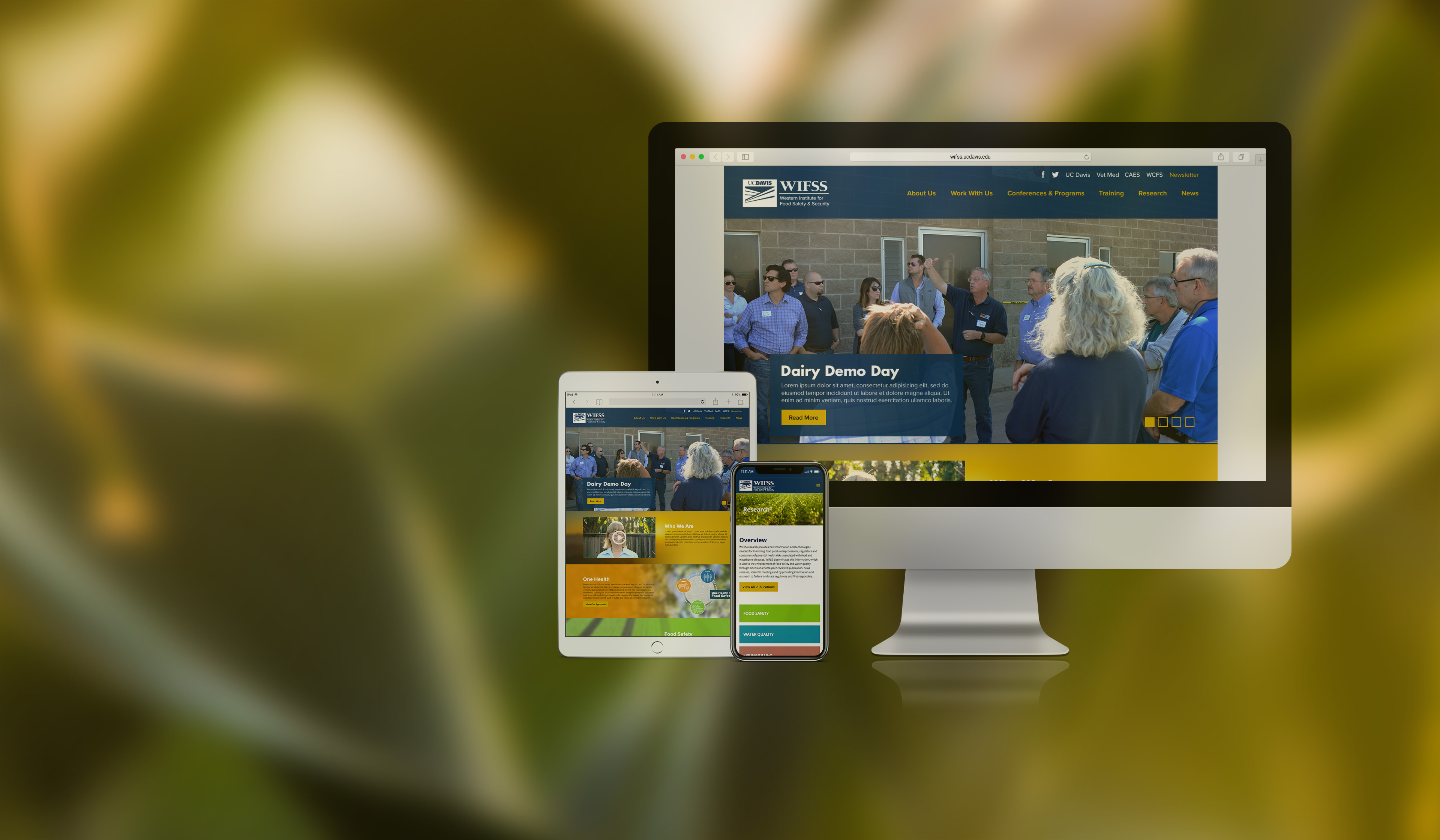
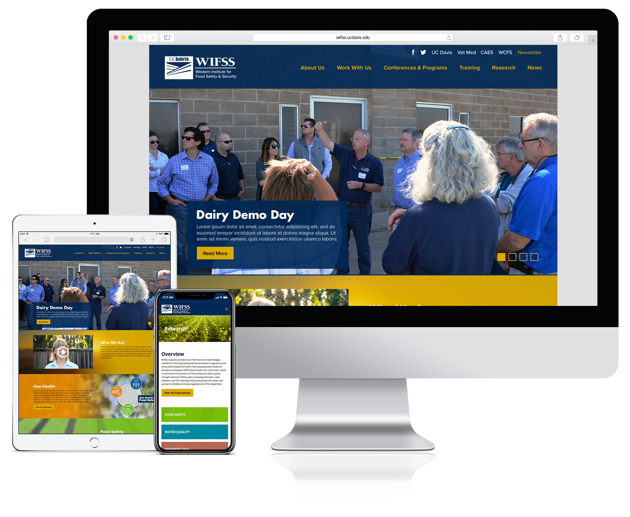
Use Case #3: Responsive Design
As a user, I want to be able to access all the materials and information WIFSS has to offer on my phone. As a stakeholder, I want to be able to show the work of WIFSS when I’m at meeting or conferences. The site should be responsive and look professional on any device.
User Experience
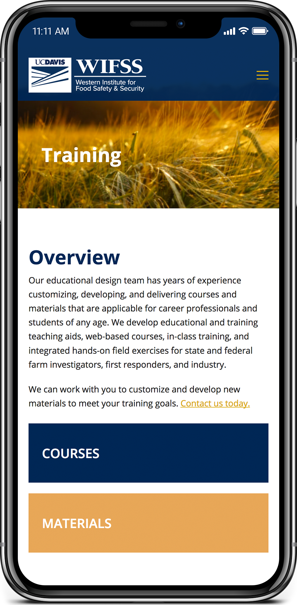
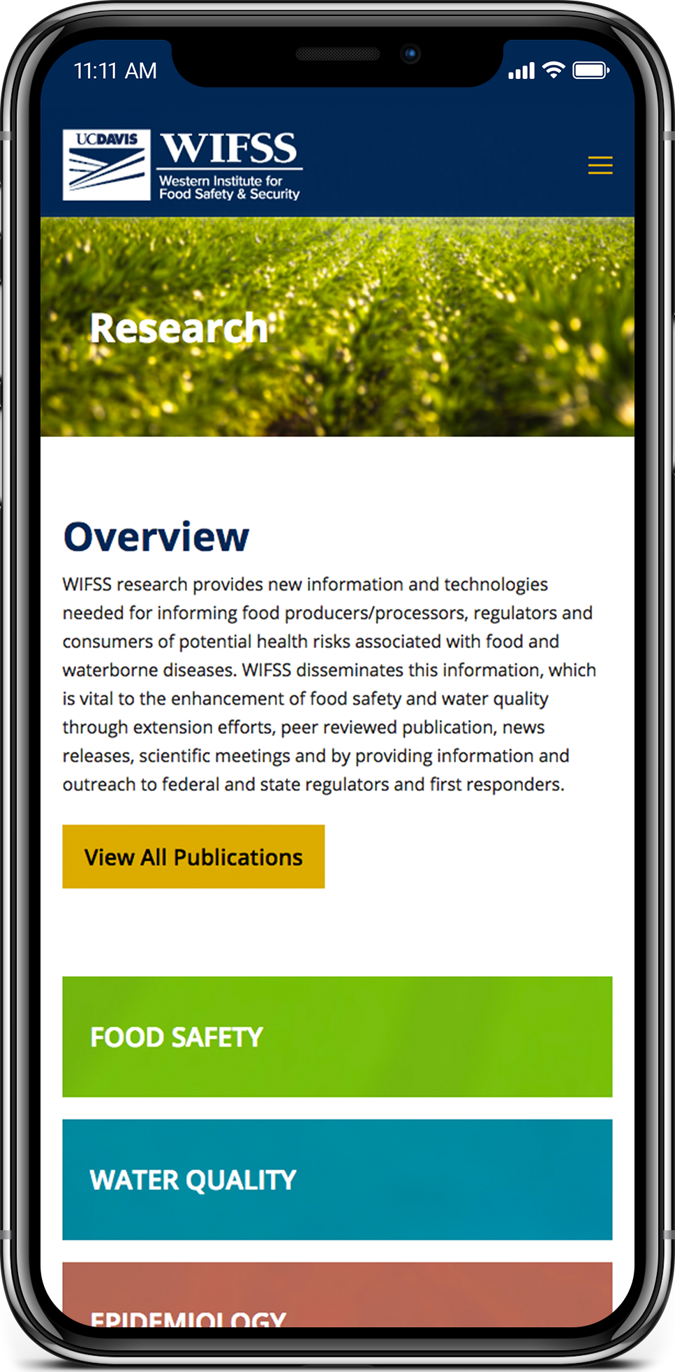
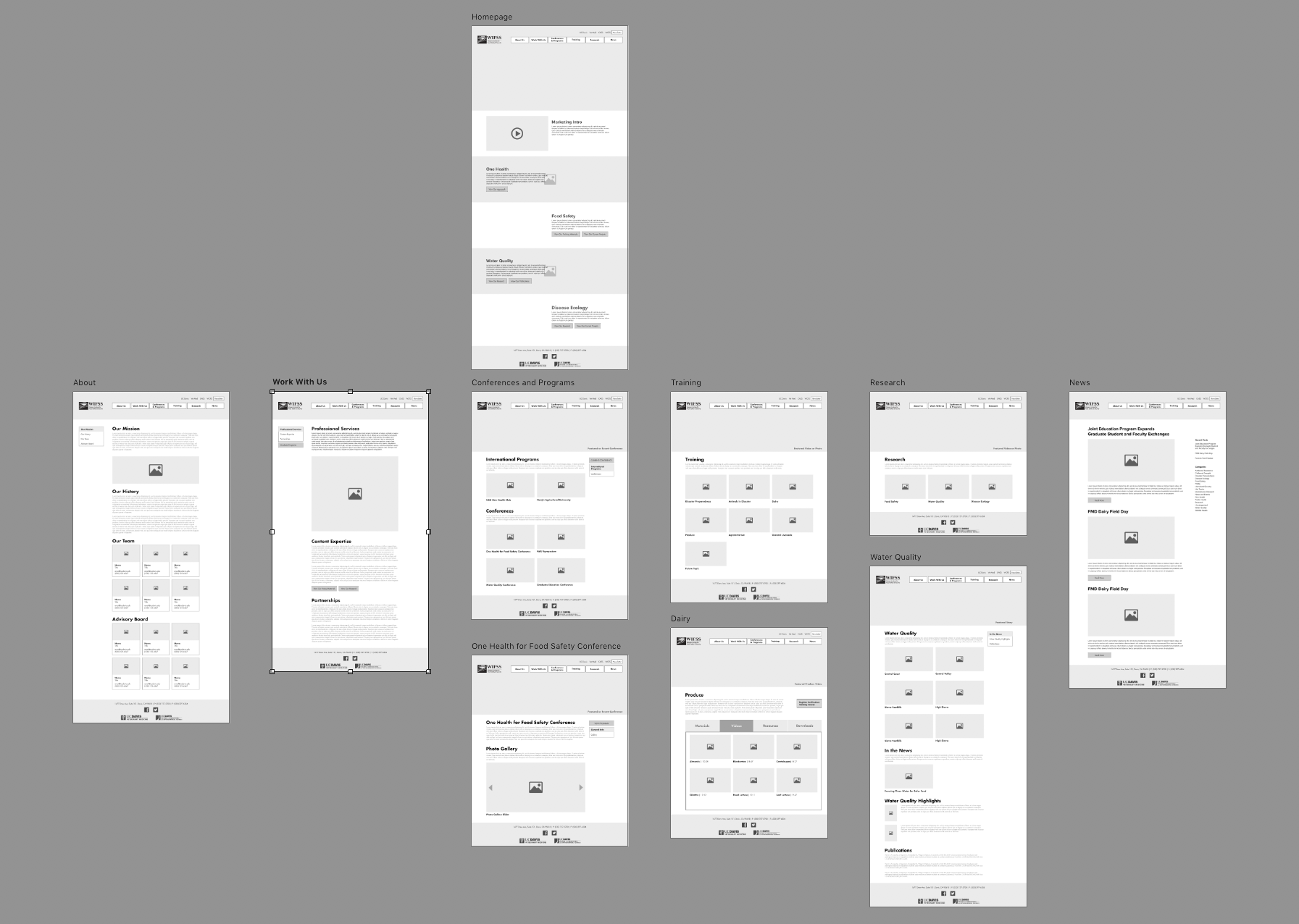
With a simpler information architecture and content structure, we then moved on to design the user experience through wireframe iterations, in which the layout of every page template prioritized the ease of navigation, both globally and locally on the page.
We took advantage of several established web patterns, such as sidebars and accordions (1), to organize the content into a grid that contained much more white space than the previous website. We then applied color and graphic elements to action items, like buttons and tabs (2), in order to give them the appropriate hierarchy, which, in combination with our refined information architecture, established a simpler and quicker way to access the content our users wanted to primarily see: training and research materials.
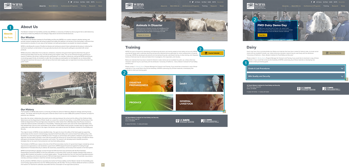
Finally, by designing the UX of all pages at once, we could ensure consistency of elements and UI patterns used throughout all pages.
Visual Design
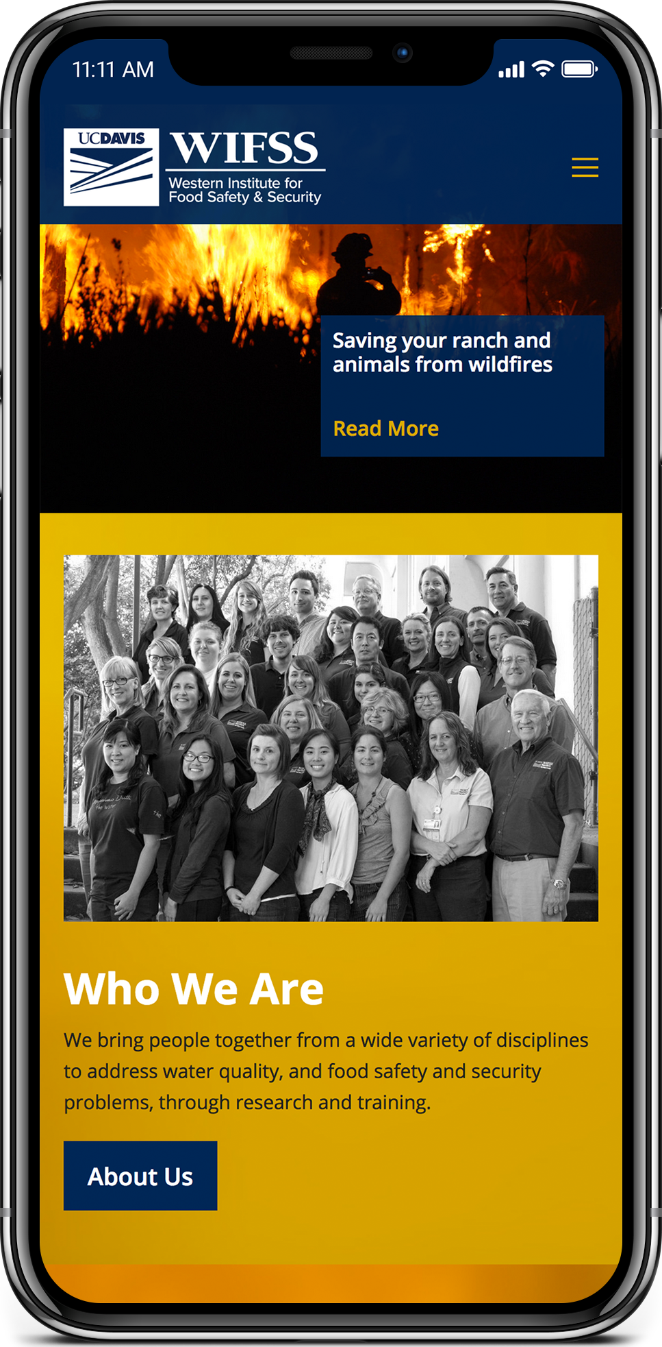
While our deliberate use of more white space made the site look more simple and modern, we also wanted the interface to be more bold and energetic. We had amassed a great collection of beautiful images of farms, livestock, and landscapes that we had taken during all of our many video and photo shoot projects all around California. We decided to use these along with the extended color palette of the UC Davis branding system to add a more rich and vibrant visual experience to the website.

Whereas the previous website was primarily text with small images and made for a somewhat uninviting experience, our vibrant use of color and images— combined with thoughtful application of white space—reinforced a more modern, professional, and inspiring experience for our users that allowed for better readability and exploration of content.